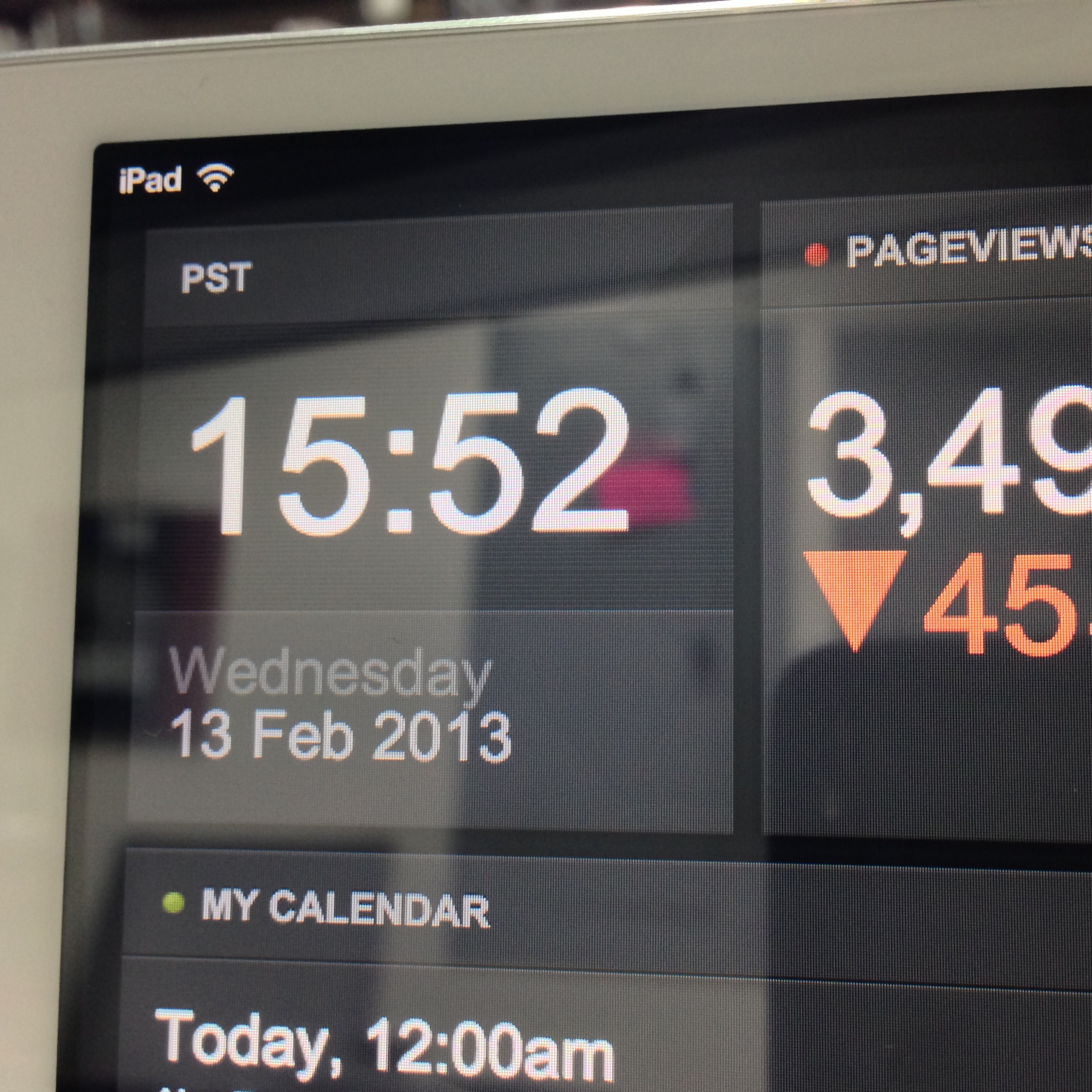
One of the cool tech toys I’ve been introduced to at my job is called
Geckoboard. It’s a nice slick website that allows you (or your company) to have a custom web-based dashboard with whatever data you want. Geckoboard is cool, but the power lays in its ability to be used for custom widgets. With these custom widgets, you can push/pull data from any source you want and have it displayed on your dashboard. My IT department runs HelpSpot for ticket tracking and I really want to have a more visual feel for how things are going. Since Geckoboard doesn’t have built-in widgets for HelpSpot, this seemed like the perfect time to write some PHP and run my own custom widgets.
I wrote one all-encompassing script for HelpSpot which generates 4 different charts and sends the data to Geckboard via the
Push API. You can find the code on Snowulf’s GitHub repo. It’s all written in PHP and uses Composer for dependencies. The README file covers how to use Composer. I commented my code (which I normally don’t do), so hopefully it is understandable to the general public. Now, let’s talk about these charts.
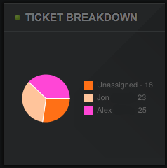
Tickets Currently Open — Pie chart
This pie chart should be fairly self explanatory. It shows you a breakdown of all the currently open tickets by who owns them. There is also an extra slice of pie for all unowned tickets. The code automatically pulls the names from HelpSpot, so there is no need to configure who to look for. I also had the code generate a sha1 hash of the name upon which the color is based. This way the color is random per individual, but will also be the same (unless the user/owner’s name changes).
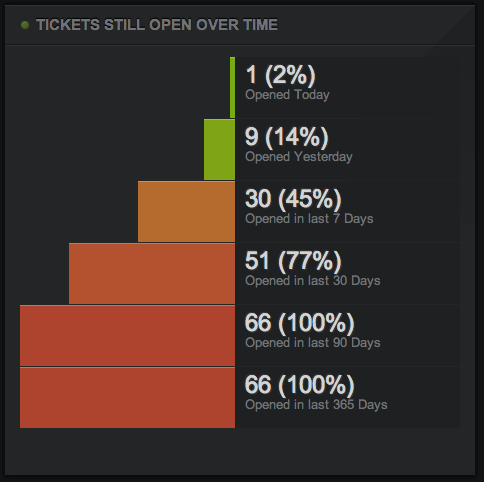
Tickets Still Open — Funnel chart
While it is easy (and sometimes depressing) to see how many tickets are open, I also want to view how old the currently open tickets are. That’s where this funnel chart comes in. It pulls the currently open tickets based on relative open date. Geckoboard also adds color coding and percentages to each column. In my example screenshot you can see that 2% of the currently open tickets (all one of them) were opened today. The fact that only 77% of the currently open tickets were opened less than 30 days ago means I’ve got a fair number of tickets that are more than a month old, ick. This chart is easily configurable in code as to what relative time periods to use. A word of caution, each one of these is another query to the API, so it can hit your HelpSpot hard if you use a lot of these and/or have a lot of tickets.
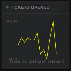
Tickets Open Over Time — Line chart
This chart was the impetus for the entire project. I wanted to have something like the default “Requests Over Time” report in HelpSpot, available via Geckoboard. That is exactly what this chart shows — the number of requests opened per date. In code I had it run the last 14 days, but that could easily be changed to any other time period. The Geckoboard line chart widget isn’t nearly as sexy as HelpSpot’s chart, but it gets the job done.
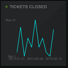
Tickets Closed Over Time — Line Chart
This last chart was a late addition, but basically works the same as the previous. The only difference is that it graphs the number of tickets closed each day, for the last 14 days.
I’m happy to entertain requests for additions (though I make no promises), pull requests, bug fixes (please use the Issue Tracker), or generally any other comment on the modules. I know that my PHP isn’t the cleanest and it doesn’t help that I wrote it in an afternoon at the office (generally a very busy time for me). It works though, and that’s all that matters.