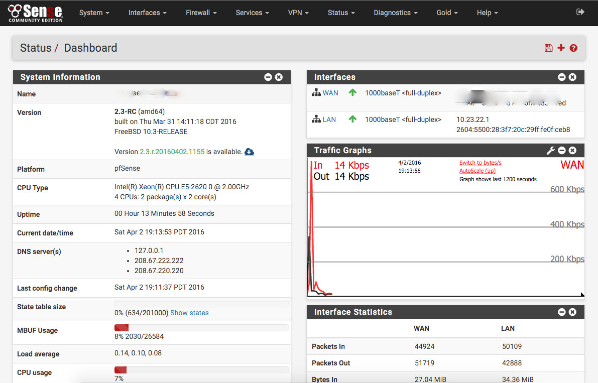
Yesterday pfSense 2.3 was release and it’s a fairly major UI change. The key is the conversion from the previous web-UI (that was tragically out of date) to a new Bootstrap based design. Not only does this make the UI look really slick, it also gains built-in responsiveness! The best part about the overhaul is that they really managed to maintain the same general look and feel while giving it a face lift. Anyone who’s familiar with pfSense won’t suddenly be left out in the cold.
Typically when a software developer makes major changes to their software, they increment the major version. Ex: 2.2 becomes 3.0. In software development this is called Semver. However, you might have noticed that this isn’t a “major” version increase and I think that’s possibly the best thing about this release. After spending some time with the release candidate over the last week or so, I can find no huge changes to the core mechanics of the release. A brand new UI without threat of my internet breaking? Yes, please!

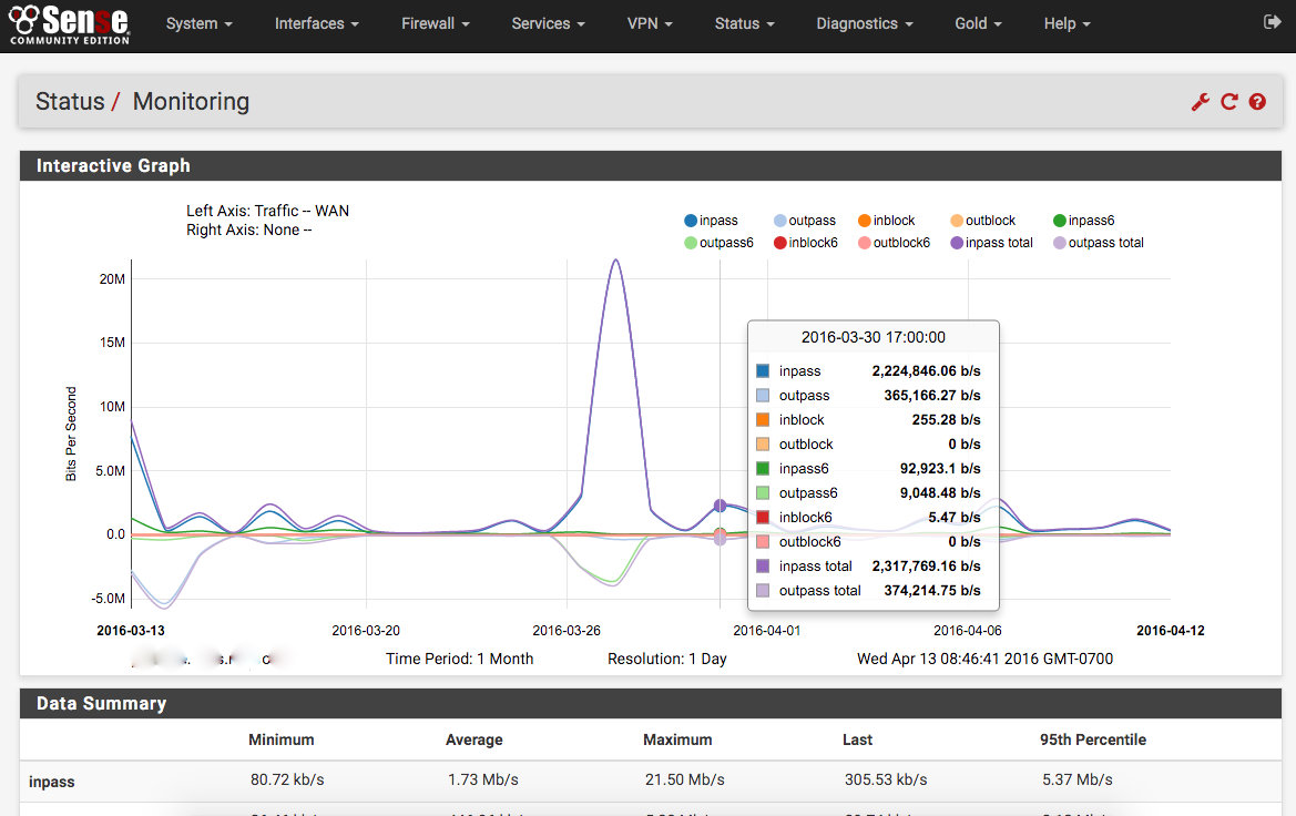
While I could include dozens of screenshots, the official “2.3 Features and Highlights” video does a much better job. However, there is one screen that does deserve special attention. The old RRDGraphs have been removed and replaced with the Monitoring screen (Status > Monitoring). The data visible can be customized (with the wrench) but what is shown to the left is the bandwidth graph (obviously the most useful). There are dozens of options and, even more useful, tons of visible data. The new charts use D3.js and are extremely fast. If you regularly used the RRDGraphs before, you know they could be quite sluggish to update and difficult to read.
As with any major change, caution is always recommended. The biggest “gotcha” will be the plugins, some of which may not be updated to the new UI or have been deprecated. My system upgraded from 2.2 to the 2.3-RC without so much as batting an eye. The few weeks after that were smooth (responsive) sailing as well, so a highly recommended upgrade overall.